Example - Tracking Impaired Waters
Source:vignettes/articles/Example---Tracking-Impaired-Waters.Rmd
Example---Tracking-Impaired-Waters.Rmd
library(rATTAINS)
library(dplyr)
#>
#> Attaching package: 'dplyr'
#> The following objects are masked from 'package:stats':
#>
#>     filter, lag
#> The following objects are masked from 'package:base':
#>
#>     intersect, setdiff, setequal, union
library(ggplot2)
library(ggrepel)
library(ggtext)
library(mpsTemplates)
mpsTemplates::noto_dark_geom_defaults()
Tracking impaired uses
A simple example utilizing ATTAINS data is tracking the changes in
waters assessed as “impaired” from year to year. We can access this data
using the state_summary() function that will provide
aggregated information about assessment decisions by organization
identifier. First we need to find out what organization identifier to
use:
domain_values(domain_name = "OrgStateCode") |>
  filter(code == "TX")
#> # A tibble: 2 × 6
#>   domain       name  code  context  context2 dateModified
#>   <chr>        <chr> <chr> <chr>    <chr>    <chr>
#> 1 OrgStateCode TX    TX    TCEQMAIN State    2024-09-10
#> 2 OrgStateCode TX    TX    EPA      EPA      2017-08-28
It appears we can use TCEQMAIN as a identifier code if
we are interested in assessment summaries in the state of Texas. I’m
interested in the three most recent assessment cycles. Unfortunately, we
can’t use multiple values in the reporting_cycle argument
so we need to either loop through the calls or do some row binding.
Since it is just a few years, I will just bind the rows.
df <- state_summary(organization_id = "TCEQMAIN", reporting_cycle = "2022") |>
  bind_rows(state_summary(
    organization_id = "TCEQMAIN",
    reporting_cycle = "2020"
  )) |>
  bind_rows(state_summary(
    organization_id = "TCEQMAIN",
    reporting_cycle = "2018"
  )) |>
  bind_rows(state_summary(
    organization_id = "TCEQMAIN",
    reporting_cycle = "2016"
  ))
Next summarize the counts of “causes” by reporting cycle and designated use:
df_uses <- df |>
  tidyr::unnest(items) |>
  tidyr::unnest(parameters, names_repair = "unique") |>
  filter(useName != "DOMESTIC WATER SUPPLY - PUBLIC WATER SUPPLY") |>
  mutate(
    reportingCycle = as.numeric(reportingCycle),
    causeCount = as.numeric(`Cause-count`)
  ) |>
  group_by(reportingCycle, useName) |>
  summarise(count = sum(causeCount, na.rm = TRUE)) |>
  ungroup()
#> New names:
#> `summarise()` has regrouped the output.
#> • `Insufficient Information` -> `Insufficient Information...12`
#> • `Insufficient Information-count` -> `Insufficient Information-count...13`
#> • `Insufficient Information` -> `Insufficient Information...21`
#> • `Insufficient Information-count` -> `Insufficient Information-count...22`
Finally, plot with some ggplot and ggrepel magic:
ggplot(df_uses, aes(x = reportingCycle, y = count, group = useName)) +
  geom_line(aes(color = useName)) +
  geom_text_repel(
    data = df_uses |> filter(reportingCycle == 2022),
    aes(label = useName),
    size = 2.5,
    hjust = "left",
    fontface = "bold",
    direction = "y",
    nudge_x = 5,
    color = alpha("white", .75)
  ) +
  geom_text_repel(
    data = df_uses |> filter(reportingCycle == 2016),
    aes(label = useName),
    size = 2.5,
    hjust = "right",
    fontface = "bold",
    direction = "y",
    nudge_x = -5,
    color = alpha("white", .75)
  ) +
  geom_label(
    aes(label = count),
    size = 2,
    label.padding = unit(0.05, "lines"),
    label.size = 0.0,
    fill = "#17262b",
    color = alpha("white", .75)
  ) +
  scale_x_continuous(
    position = "top",
    breaks = c(2016, 2018, 2020, 2022),
    expand = expansion(mult = 0.25)
  ) +
  scale_color_brewer(palette = "Accent") +
  theme_mps_noto_dark() +
  theme(
    axis.ticks = element_blank(),
    axis.title.y = element_blank(),
    axis.title.x = element_blank(),
    axis.text.y = element_blank(),
    legend.position = "none",
    panel.border = element_blank(),
    panel.grid.major.x = element_blank(),
    panel.grid.minor.x = element_blank(),
    panel.grid.major.y = element_blank(),
    panel.grid.minor.y = element_blank()
  )
#> Warning: The `label.size` argument of `geom_label()` is deprecated as of ggplot2 3.5.0.
#> ℹ Please use the `linewidth` argument instead.
#> This warning is displayed once per session.
#> Call `lifecycle::last_lifecycle_warnings()` to see where this warning was
#> generated.
#> Warning: The `size` argument of `element_line()` is deprecated as of ggplot2 3.4.0.
#> ℹ Please use the `linewidth` argument instead.
#> ℹ The deprecated feature was likely used in the mpsTemplates package.
#>   Please report the issue to the authors.
#> This warning is displayed once per session.
#> Call `lifecycle::last_lifecycle_warnings()` to see where this warning was
#> generated.
#> Warning: The `size` argument of `element_rect()` is deprecated as of ggplot2 3.4.0.
#> ℹ Please use the `linewidth` argument instead.
#> ℹ The deprecated feature was likely used in the mpsTemplates package.
#>   Please report the issue to the authors.
#> This warning is displayed once per session.
#> Call `lifecycle::last_lifecycle_warnings()` to see where this warning was
#> generated.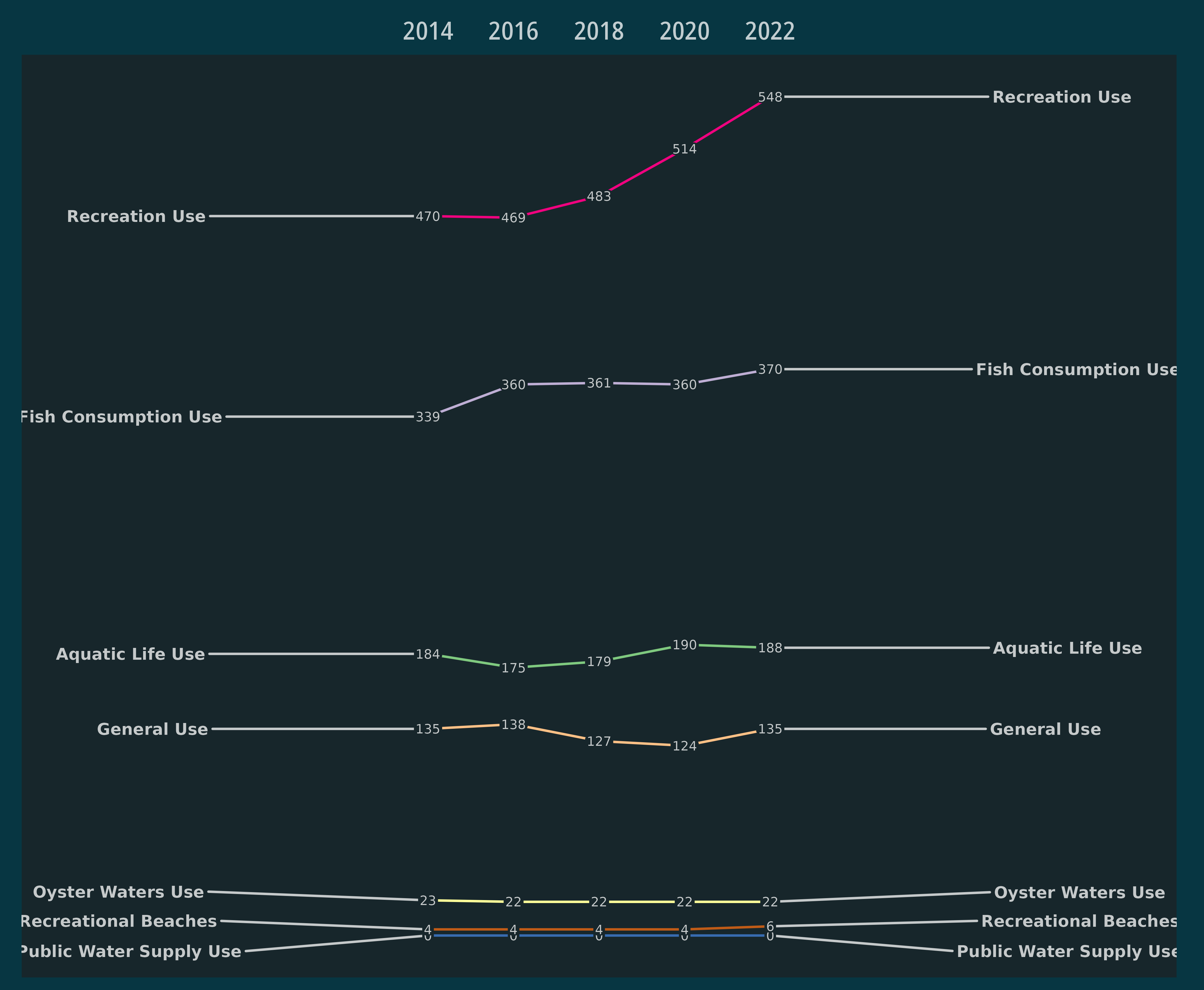
Tracking parameter assessments
Instead of the number of impaired assessment units, this example examines the proportion of assessed stream miles or water body acres that are impaired due to a particular water qualiyt parameter.
df |>
  tidyr::unnest(items) |>
  tidyr::unnest_longer(parameters) |>
  tidyr::unnest(parameters, names_sep = "_") |>
  group_by(waterTypeCode) |>
  filter(
    useName %in%
      c(
        "Recreation Use",
        "General Use",
        "Aquatic Life Use",
        "Fish Consumption Use"
      )
  ) |>
  filter(waterTypeCode != "WETLANDS, FRESHWATER") |>
  mutate(
    parameters_parameterGroup = gsub("/", "<br>", parameters_parameterGroup)
  ) |>
  mutate(
    assessed = `Fully Supporting` + `Not Supporting`,
    percent_impaired = `Not Supporting` / `assessed` * 100
  ) |>
  ggplot() +
  geom_col(aes(reportingCycle, percent_impaired)) +
  facet_grid(
    rows = vars(parameters_parameterGroup),
    cols = vars(waterTypeCode)
  ) +
  labs(
    x = "",
    y = "Percent of assessed water bodies impaired",
    caption = "Estuary, Ocean, Reservoir =  % of acres assessed\n
       Stream, and Stream, Tidal =  % of miles assessed"
  ) +
  theme_mps_noto_dark() +
  theme(
    axis.text.x = element_text(size = 6, angle = 45),
    axis.text.y = element_text(size = 6),
    strip.text.y = element_markdown(angle = 0, hjust = 0, size = 8),
    strip.text.x = element_text(size = 8),
    strip.background = element_blank(),
    legend.position = "none"
  )
#> Warning in min(x): no non-missing arguments to min; returning Inf
#> Warning in max(x): no non-missing arguments to max; returning -Inf
#> Warning in min(x): no non-missing arguments to min; returning Inf
#> Warning in max(x): no non-missing arguments to max; returning -Inf
#> Warning in min(x): no non-missing arguments to min; returning Inf
#> Warning in max(x): no non-missing arguments to max; returning -Inf
#> Warning in min(x): no non-missing arguments to min; returning Inf
#> Warning in max(x): no non-missing arguments to max; returning -Inf
#> Warning in min(x): no non-missing arguments to min; returning Inf
#> Warning in max(x): no non-missing arguments to max; returning -Inf
#> Warning in min(x): no non-missing arguments to min; returning Inf
#> Warning in max(x): no non-missing arguments to max; returning -Inf
#> Warning in min(x): no non-missing arguments to min; returning Inf
#> Warning in max(x): no non-missing arguments to max; returning -Inf
#> Warning in min(x): no non-missing arguments to min; returning Inf
#> Warning in max(x): no non-missing arguments to max; returning -Inf
#> Warning in min(x): no non-missing arguments to min; returning Inf
#> Warning in max(x): no non-missing arguments to max; returning -Inf
#> Warning in min(x): no non-missing arguments to min; returning Inf
#> Warning in max(x): no non-missing arguments to max; returning -Inf
#> Warning in min(x): no non-missing arguments to min; returning Inf
#> Warning in max(x): no non-missing arguments to max; returning -Inf
#> Warning in min(x): no non-missing arguments to min; returning Inf
#> Warning in max(x): no non-missing arguments to max; returning -Inf
#> Warning in min(x): no non-missing arguments to min; returning Inf
#> Warning in max(x): no non-missing arguments to max; returning -Inf
#> Warning in min(x): no non-missing arguments to min; returning Inf
#> Warning in max(x): no non-missing arguments to max; returning -Inf
#> Warning in min(x): no non-missing arguments to min; returning Inf
#> Warning in max(x): no non-missing arguments to max; returning -Inf
#> Warning in min(x): no non-missing arguments to min; returning Inf
#> Warning in max(x): no non-missing arguments to max; returning -Inf
#> Warning in min(x): no non-missing arguments to min; returning Inf
#> Warning in max(x): no non-missing arguments to max; returning -Inf
#> Warning in min(x): no non-missing arguments to min; returning Inf
#> Warning in max(x): no non-missing arguments to max; returning -Inf
#> Warning in min(x): no non-missing arguments to min; returning Inf
#> Warning in max(x): no non-missing arguments to max; returning -Inf
#> Warning in min(x): no non-missing arguments to min; returning Inf
#> Warning in max(x): no non-missing arguments to max; returning -Inf
#> Warning: Removed 42 rows containing missing values or values outside the scale range
#> (`geom_col()`).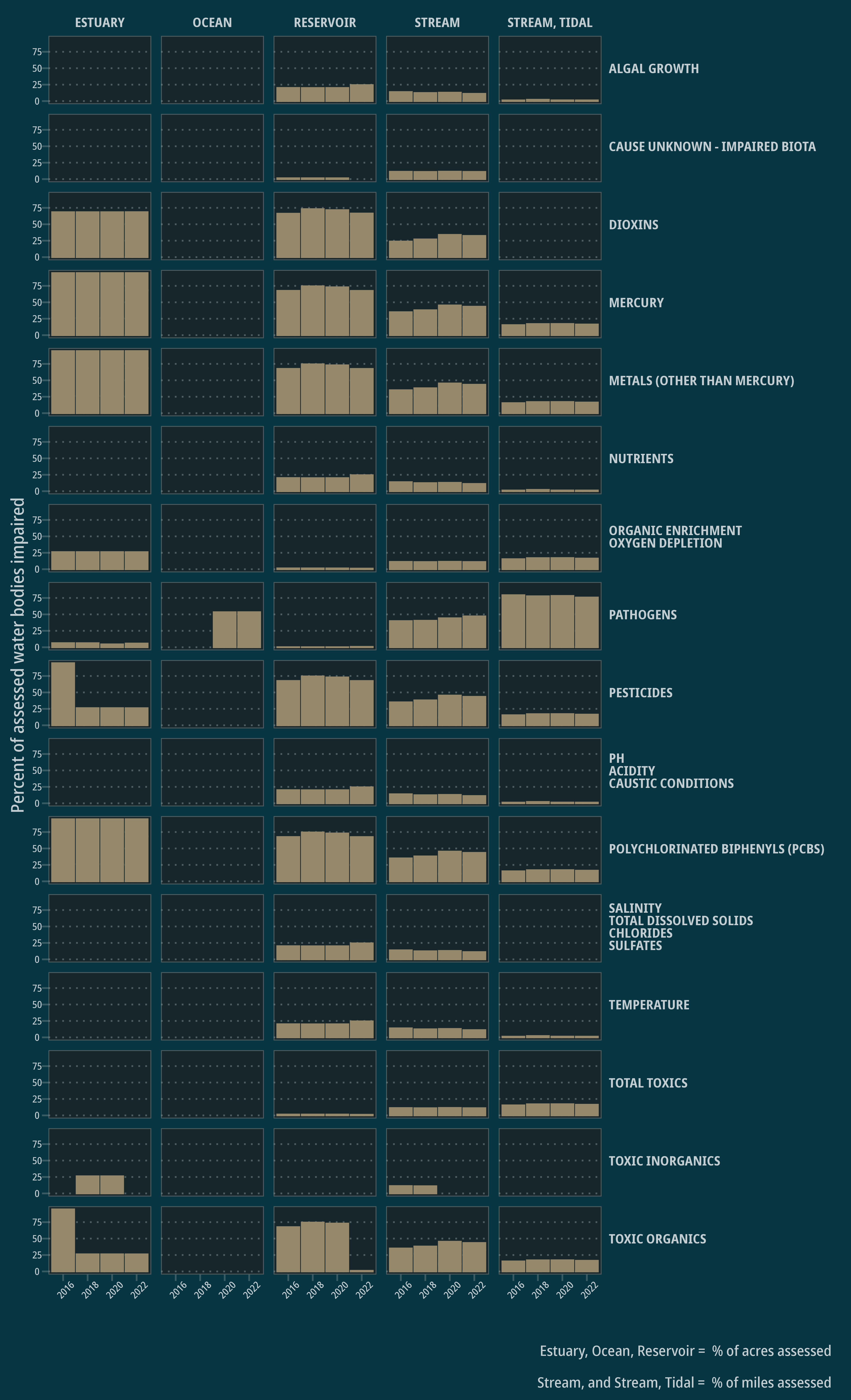
Notes
The most difficult part of utilizing this data is exploring what is included and reported by various states. Each state provides different amounts of data and often has unique codes or information under the same variable name. Having some state or tribal specific context is probably useful in interpreting the information included in the data. Also note that I do not have documentation about the specific meanings of the various output variables because that information is not provided by EPA.